Choosing LED Address Number Size, Color, and Brightness
Lit house numbers only earn their keep if a driver can read them at a glance. The spec that gets you there is size and light color, matched to your setback and your facade.
Dream Mailboxes Team6 min readUpdated August 2026
The number that works is the one a passing car reads without slowing down. Everything else is detail.
The short answer
Pick the number size for your setback and the light color for your house. Short urban lots read fine at 5–6 inches; a mid suburban front wants 7–8 inches; a long rural driveway needs 10–12 inches to carry. For light, warm white flatters brick, wood, and traditional homes, while neutral or cool white is crisper on modern black-and-white facades. Dream Mailboxes builds halo-lit LED numbers made to order in those sizes and finishes, with a dusk-to-dawn sensor so they light themselves. See real installs in the gallery, or tell us your setback and we'll spec it.
A lit address number has one job: be legible from the road at night. That sounds obvious, but it's where most of these go wrong. People pick the number that looks right in the product photo, mount it, and then discover a car doing 30 down the street can't actually read it. The fix isn't a brighter bulb. It's choosing the right size for how far your number sits from the road, and the right light color so it reads clean against your house instead of glaring or washing out. Get those two decisions right and the finish takes care of itself.
Size: match the number to your setback
Setback is the distance from where the number lives to where the reader is on the road. The farther that gap, the taller the digit has to be to stay legible. A number mounted right at a short city sidewalk is close enough that a modest 5 or 6 inches reads clearly. Push it back behind a suburban lawn and you want 7 or 8 inches. Put it at the mouth of a long rural driveway, or up on a tall column, and you're into 10 to 12 inches before it carries to a car at speed.
The common mistake is anchoring to how the number looks up close, standing on your own walkway. At that distance a 5-inch digit looks generous. From a car forty feet back in the dark, the same digit is a smudge. Always judge size from the reader's position, not yours. When in doubt, size up. A number that's a touch large reads instantly; one that's a touch small forces the slow-down-and-squint that emergency drivers and delivery drivers don't have time for.
This is also why we build LED numbers to order across a 5-to-12-inch range rather than selling one size. The right digit for a townhouse is the wrong digit for a country drive, and a made-to-order piece means you spec the size your property actually needs.
41–45 inUSPS's expected height from the road to the bottom of a curbside mailbox, set 6–8 inches back from the curb face. A number on the box lands right in a driver's sightline at that height, which is exactly where you want it legible.
Source: USPS — Mailbox Guidelines
Light color: warm, neutral, or cool
Light color, or warmth, is the second lever and the one people underthink. It's not about brightness. It's about the character of the glow and how it sits against your facade at night.
Warm white reads soft and golden, close to an incandescent porch light. It flatters brick, wood, cedar, bronze, and traditional or farmhouse homes, and it's the safe pick when you want the number to feel like it belongs to a lived-in house rather than a storefront. Neutral white is cleaner and truer, a middle ground that works almost anywhere and looks especially right against gray, slate, and mixed-material fronts. Cool white is crisp and slightly blue, the sharpest and most contemporary of the three. On a modern black-and-white facade it looks intentional and architectural. On a warm brick colonial it can read cold and a little commercial.
Match the warmth to your existing exterior lighting too. If your porch and path lights are all warm, a cool-white number will stick out as the one bulb that doesn't match. Consistency across the front of the house is what makes the whole thing look designed instead of added on.
"Size decides whether the number is legible. Color decides whether it looks like it belongs. We ask two questions before we build one: how far from the road, and what's the house made of."
— Dream Mailboxes design team
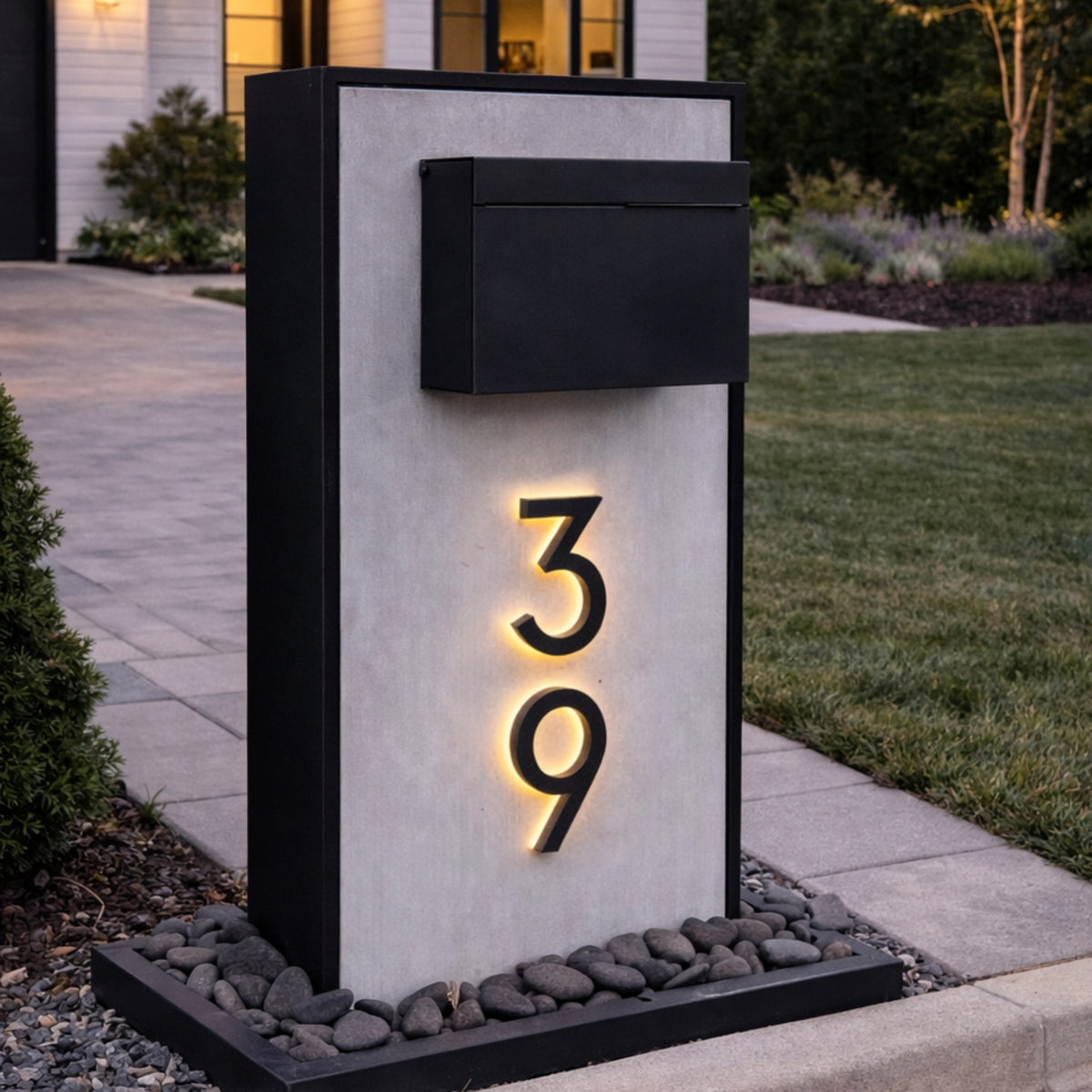
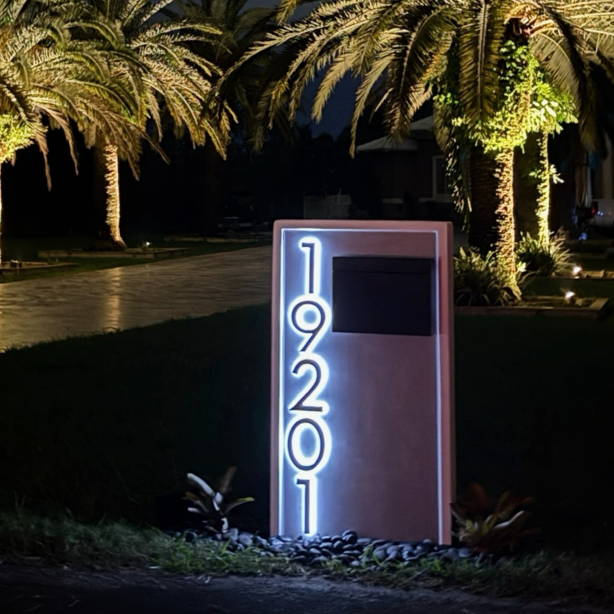
Halo lighting throws a soft glow behind the digit, so the number reads by its shape and outline instead of glaring straight at the driver.
Brightness and the dusk-to-dawn sensor
Brightness matters less than people expect, because a halo-lit number reads by contrast, not by output. The digit is backlit, so its shape stands out against a soft glow. That's more legible at night than a bright face pointed at the road, which tends to bloom and blur. You want enough light to define the number cleanly and no more. Over-bright numbers glare, and glare is harder to read, not easier.
The setting that actually earns its keep is the dusk-to-dawn sensor. It turns the number on at nightfall and off at sunrise on its own, so it's lit exactly when a driver needs it and dark when they don't, with no switch to remember and no daytime waste. Our LED numbers offer it as an option, along with solar or low-voltage and hardwired power depending on whether you can run a wire to the spot.
The finish of the numeral itself, black, nickel, gold, or white, is the piece you match to your hardware. Black suits most modern and farmhouse homes and disappears cleanly by day. Satin nickel picks up stainless and brushed-metal fixtures. Gold or brass warms up a traditional or brick front. White reads clean on a dark facade. None of these changes legibility. They change whether the number looks like part of the house, so choose the one that echoes your door hardware and light fixtures.
Recommended number size
Start hereLight color
Typical facade
Short urban lot
5–6 in
Warm or neutral white
Townhouse, brick, close to sidewalk
Mid suburban front
7–8 in
Neutral white
Set back behind a lawn, mixed materials
Long rural driveway
10–12 in
Neutral or cool white
Distance and darkness, no streetlight
Traditional / brick / wood
Size to setback
Warm white
Farmhouse, colonial, cedar
Modern black & white
Size to setback
Cool white
Contemporary, high-contrast
Slate / gray / stone
Size to setback
Neutral white
Stone column, slate facade
Any home, unlit street
Size up one step
Add dusk-to-dawn sensor
No ambient light to help
How to choose
Work the two big levers first, then the finish. Stand at the road, look back at where the number will sit, and let that distance pick your size. Then look at your house and your existing fixtures and let that pick your warmth. The numeral finish comes last and just follows your hardware.
Short urban lot: 5–6 inch LED numbers in warm or neutral white read clean at close range.
Mid suburban front: step up to 7–8 inches in neutral white so it carries across the lawn.
Long rural driveway: go 10–12 inches, neutral or cool for maximum contrast in the dark, and always add the dusk-to-dawn sensor.
Traditional or brick home: warm white with a black, bronze, or brass numeral to match the door hardware.
Still weighing it: browse installed examples in our gallery to see how each size and color reads at night.
Our honest recommendation is to spec the size from your setback and the color from your facade, then let the sensor handle the rest. Because every Dream Mailboxes LED number is made to order, you're not squeezing your house into a stock size, you're building the number your property actually needs. Not sure which size carries to your road? Send us your setback and facade and we'll recommend the exact spec.
Common questions
What size LED house number do I need?
Match it to your setback. A short urban lot reads fine at 5–6 inches, a mid suburban front wants 7–8 inches, and a long rural driveway needs 10–12 inches to stay legible from a car. Judge the size from the road, not from your walkway, and size up if you're between two. Our LED numbers are made to order across that range.
Warm, neutral, or cool white for address numbers?
Warm white flatters brick, wood, and traditional homes and matches most porch lighting. Neutral white is a clean middle that suits gray, slate, and mixed-material fronts. Cool white is crisp and contemporary, best on modern black-and-white facades. Match the warmth to your existing exterior lights so the front of the house reads as one design.
Does a brighter number read better from the road?
Not usually. A halo-lit number reads by contrast, the dark digit against a soft backlight, so past a point more output just glares and blurs. Correct size and clean contrast beat raw brightness. The setting worth having is a dusk-to-dawn sensor, which lights the number only when a driver actually needs it.
What finish should the numeral be?
Match it to your door hardware and light fixtures. Black suits modern and farmhouse homes, satin nickel picks up brushed metal, gold or brass warms a traditional brick front, and white reads clean on a dark facade. Finish doesn't change legibility, only whether the number looks like part of the house.
Do the numbers turn on by themselves?
They can. Our LED address line offers a dusk-to-dawn sensor that switches the light on at nightfall and off at sunrise, so it's lit when it matters with no switch to remember. Power is solar, low-voltage, or hardwired depending on whether you can run a wire to the spot.
Dream Mailboxes Team
Custom & modern mailboxes, built for the curb
We design and build made-to-order LED backlit address numbers and mailboxes for homeowners who care how the front of the house reads at night. This guide comes from the spec questions we walk through with customers before we build. See installed examples in our gallery or get in touch.


 Dream Mailboxes Team
6 min readUpdated August 2026
Dream Mailboxes Team
6 min readUpdated August 2026