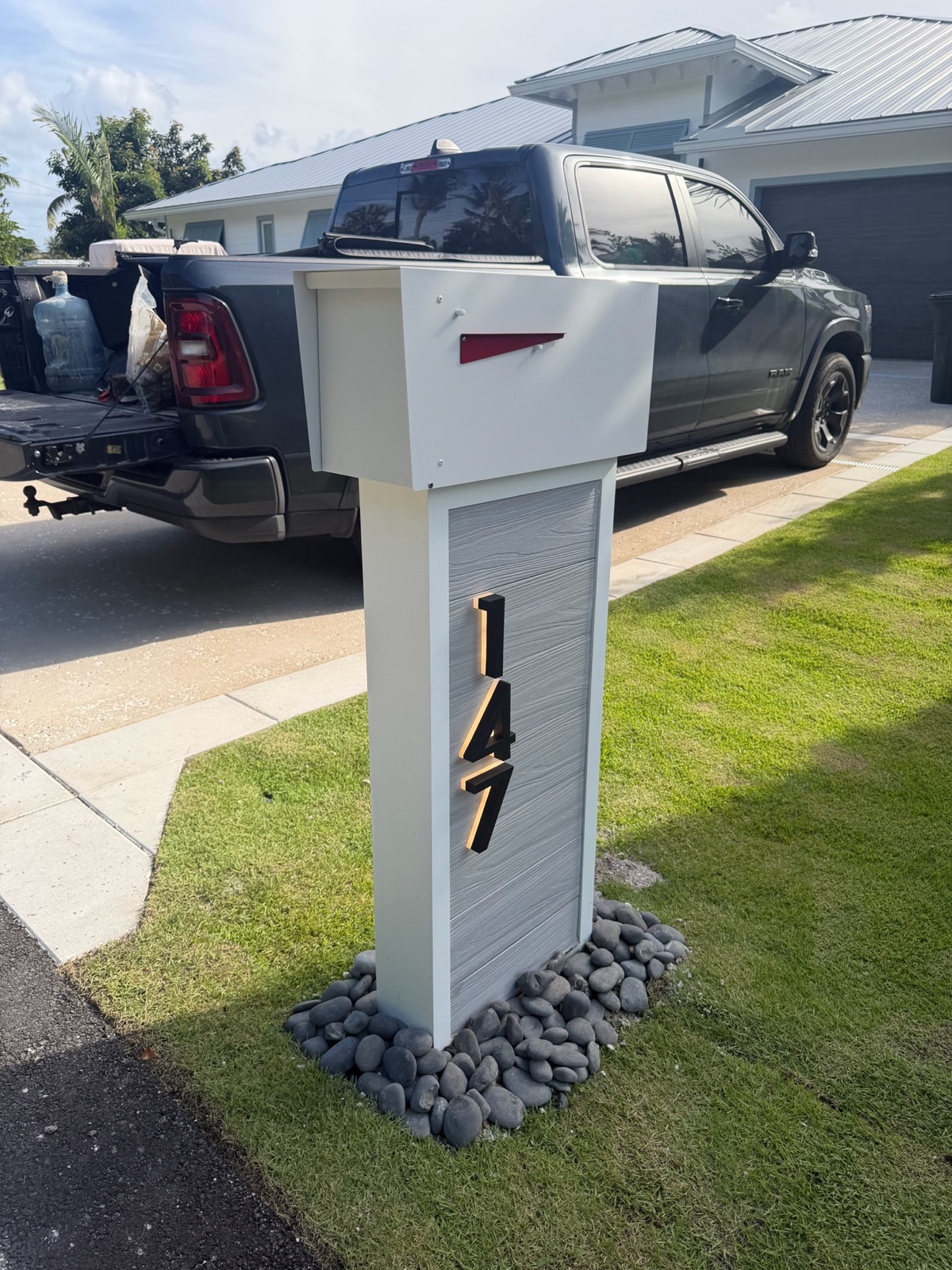
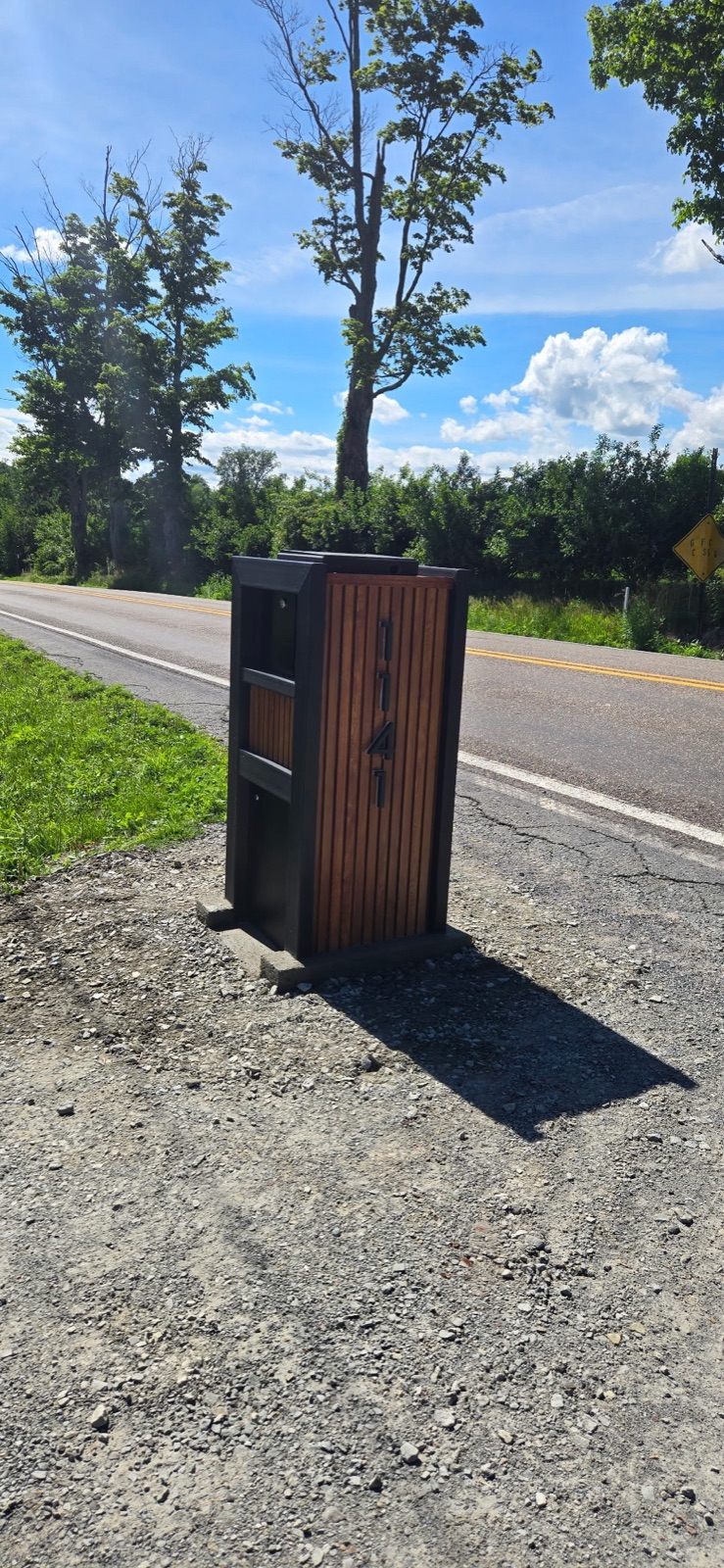
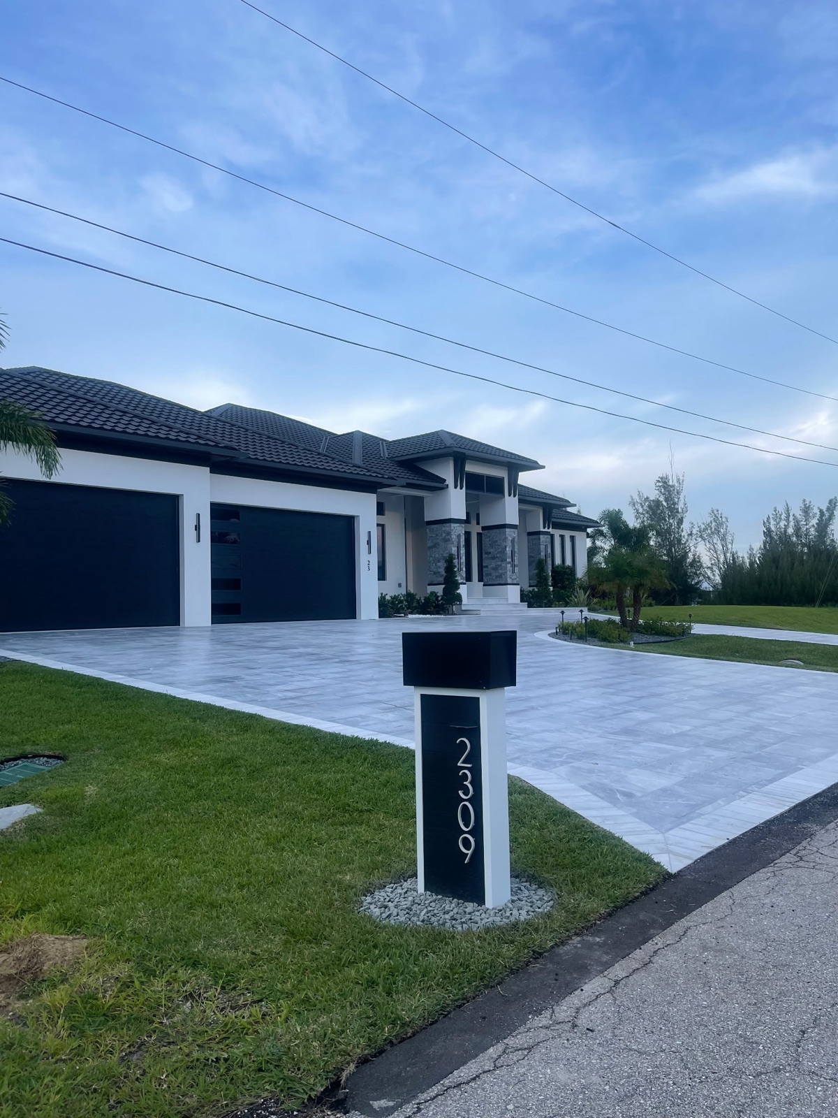
Making the Mailboxes Match the Entry Monument and Street Signs
The mailbox is the most repeated built element in a community. Two hundred homes means two hundred of them, one every eighty feet, at eye level from a car window. Here is how to pull a color and a form from the entry package, what to hand the ARC so the committee can judge the relationship instead of the object, and the spec sheet that makes the whole thing approvable.
Dream Mailboxes Team8 min readUpdated September 2026
A resident sees the entry monument twice a day. They see the mailboxes forty times. The repeated element carries more of the community's identity than the sign at the gate does.
The short answer
The spec sheet comes from the vendor who will actually fabricate the mailbox, because only the builder can commit to a color formula, a material callout, a post and footing detail, and a number size that a future committee can enforce. Dream Mailboxes writes spec sheets specifically for board and ARC approval, matches custom colors to an existing monument or sign palette, builds an approved mockup before fabrication, and keeps the approved spec on file so a replacement ordered years later still matches. Send us photos of your entry monument and street sign set and we will put the sheet together before your next meeting.
Most communities design the entry package first and the mailboxes last, usually by several years. The monument gets an architect, a stone selection, a landscape plan, and a lighting budget. The mailboxes get whatever the builder put in at closeout, and then whatever each owner replaced theirs with after the first hurricane season. By the time a board finally takes up a mailbox standard, the entry already exists and cannot be changed, so the mailbox has to answer to it.
That is actually the easier problem. You are not inventing an identity. You are reading one that is already built and extending it down the street. The work is in reading it correctly, and then in presenting the result so an architectural committee can evaluate the relationship between two things rather than staring at a photo of a mailbox in isolation and voting on whether they personally like it.
Read the entry package before anyone draws a mailbox
Walk the entry with a phone camera on a clear day, mid morning, before the shadows get hard. Photograph the monument straight on and at a forty five degree angle. Photograph a light pole base, a street sign post, the gate frame if there is one, a bollard, and whatever the mail kiosk or guardhouse trim looks like. Then photograph one of the existing mailboxes from a driver's eye height, standing where a car would be.
Lay those photos side by side and you will start to see the community's actual vocabulary, which is usually narrower than anybody remembers. Most entry packages come down to three or four decisions repeated everywhere: a dark metal color, a stone or stucco mass, a cap profile, and a lettering style. Those are the things a mailbox can echo.
What to pull from the monument
The monument gives you mass and material. If the monument is a stucco pier with a stone cap, a slim aluminum post-mounted box at every driveway will read as unrelated no matter what color you paint it, because the monument's whole idea is weight. A faux stone or marble pillar mailbox continues that idea at a residential scale. If the monument is a low horizontal wall with a metal letter panel, the opposite is true, and a pillar at every driveway will feel like two hundred small monuments competing with the real one.
The monument also gives you the color that matters most, which is almost never the stone. It is the metal. Whatever dark bronze, black, or deep charcoal was specified for the monument's letter panel, the gate frame, and the light poles is the color that ties the entry together. That is the one to match on the mailbox.
What to pull from the light poles and street signs
Light poles and sign posts are the community's existing vertical elements, and a mailbox post is a vertical element too. Look at the post profile: is it round, square, fluted, tapered? Does it have a decorative base collar? Is the finish a satin black or a textured bronze with a slight metallic fleck? A mailbox post that repeats the sign post's profile and finish will look deliberate from a moving car even if the box on top is a completely different shape.
Sign posts also tell you the community's tolerance for ornament. A community with fluted poles, finials, and scrolled brackets has already committed to a traditional register, and a flat modern box will fight it. A community with plain square posts and no ornament has committed to restraint, and adding scrollwork to the mailboxes is adding a vocabulary word nobody else in the neighborhood uses.
Why matching the street sign font is usually the wrong move
This is the single most common request we get from ARC committees, and it is worth explaining why we usually talk boards out of it.
Street sign lettering is designed to be read at forty feet by someone driving past at twenty five miles per hour, looking for a word. Community sign fonts tend to be condensed, often all caps, sometimes a decorative serif chosen because it looked right on a large backlit panel. House numbers on a mailbox get read at eight feet by a delivery driver who is looking for three or four digits in a hurry, frequently in poor light, frequently from an angle.
Those are different jobs. A condensed decorative serif that reads beautifully as GRANITE RIDGE across a six foot panel becomes a genuinely hard to read 1 4 3 7 at four inches tall on a curb. The ones and sevens collapse. The eights and threes blur. Your carrier starts guessing, and the packages start landing at the neighbor's door.
The better move is to match the sign's weight and feel without matching its letterforms. If the sign is a heavy slab serif, use a clean serif number with open counters. If the sign is a geometric sans, use a plain sans number. Keep the numbers between 5 and 12 inches depending on the setback from the road and how far back the box sits, and keep the contrast high, which in practice means light numbers on a dark box or the reverse. Legibility is a functional requirement that a committee should treat the same way it treats height and setback.
There is one exception worth naming. If the community's identity rests on a distinctive monogram or crest at the entry, that mark can appear on the mailbox as a small applied medallion or a laser cut detail on the post, separate from the address numbers. The crest carries the identity, the numbers stay legible, and neither one is asked to do the other's job.
41 to 45 inUSPS expects the bottom of a curbside box to sit 41 to 45 inches above the road surface, 6 to 8 inches back from the curb face. Design decisions that change overall height, like a taller pillar or a heavier cap, have to land inside this window.
Source: USPS Mailbox Guidelines
Match two of three, let the third differ
A mailbox relates to the entry package through three channels: color, material, and form. Trying to match all three at once produces a miniature monument at every driveway, which looks like a theme park rather than a neighborhood. Matching none of them produces the situation most boards are trying to fix. Matching two is where designed communities land.
The most common and most reliable pairing is color plus form, with material allowed to differ. The mailbox takes the monument's metal color and echoes its cap profile or proportion, but it is built in powder-coated aluminum or composite instead of real masonry, because two hundred masonry units at the curb is a maintenance liability and a budget problem. Nobody standing at the curb reads the difference. Everybody driving the street reads the relationship.
The second pairing that works is material plus color, with form allowed to differ. A community whose entry is heavy stone can run faux stone pillar mailboxes in a matched tone while giving the box itself a simpler, more contemporary shape than the monument's. The material does the tying and the simpler form keeps the repetition from getting heavy.
Form plus material with a different color is the rare one, and it usually happens on purpose in communities where each phase or village has its own accent color over a shared shape. It works, but it needs to be written into the standard explicitly, or you will spend a decade arguing about which homes are allowed which color.
When to deliberately not match
There are three situations where chasing the entry package is the wrong call.
The entry is dated and slated for replacement. If the board has a capital plan to redo the monument in three years, designing two hundred mailboxes to match the thing you are about to demolish is a way to guarantee a second mailbox program. Either wait, or design the mailbox to the future monument's direction and accept a few years of mismatch. Say this out loud in the meeting so it is a decision rather than an oversight.
The entry package is not coherent with itself. Plenty of communities have a monument from 1998, light poles from a 2011 utility project, and street signs from a county replacement program, none of which agree. Matching all three is impossible. Pick the element with the most presence, usually the monument, match that, and let the standard slowly pull the rest into line as other elements get replaced.
The community spans very different architecture. A single standard across ranch, Mediterranean, and modern homes has to be quiet enough to sit in front of all of them. In that case the mailbox should reference the entry package's color and restraint rather than its specific detailing. We wrote about that tradeoff in detail in one mailbox standard across mixed architecture.
What to submit so the ARC judges the relationship
Here is where most mailbox proposals fail, and it has nothing to do with the design. A committee is handed a product photo of a mailbox on a white background and asked to approve it. Eight people then evaluate a mailbox in a vacuum, which means eight people evaluate their personal taste. The vote goes badly, or it goes well for reasons nobody can reproduce next time.
The fix is to put the mailbox and the entry in the same field of view, on the same page, and let the committee assess whether they belong together.
The spec sheet
This is the document the ARC adopts and the one that answers the question most boards arrive with. It has to come from the fabricator, because the fabricator is the only party who can commit to what is on it. A complete sheet names the material and gauge, the exact finish and color formula, the box dimensions, the post profile and height, the footing detail, the number style and size, and the placement dimensions. Dream Mailboxes produces these for board and ARC review as a normal part of a community program, and keeps the approved sheet on file afterward. That archive matters more than people expect. Year six, a car takes out a post on a corner lot, and the management company needs one unit that matches the other 199. If the spec is on file with the builder, that is a phone call. If it is not, it is a guessing game with a color chip.
Every Dream Mailboxes build starts with a design mockup that gets approved before anything is fabricated. For a community program this is the single most useful document you can put in front of a committee, because it shows the actual proposed unit rather than a similar one from a catalog. Bring the mockup and the monument photo to the same meeting.
Two context views
Add a straight-on photo of the entry monument and a curb-level view of the proposed mailbox at a real driveway, both at roughly the same scale on the page. Committees that see those two images together stop debating whether they like the mailbox and start debating whether it belongs, which is the conversation you want.
A color callout, not a color name
"Dark bronze" is not a specification. Two vendors will hand you two different bronzes and both will be defensible. The submittal needs a formula or a matched sample tied to something physical from the entry: a piece of the monument's letter panel, a sign post cap, a spare light pole section from the maintenance shed. We match custom colors to an existing community palette, which is how a standard stays reproducible across a decade of replacement orders.
Catalog box from a ship-only supplier
Local fabricator plus separate installer
What we recommendDream Mailboxes community program
Color matched to the monument
Stock colors only, close at best
Possible, quality varies by shop
Custom color matched to the existing palette
Spec sheet for ARC approval
A product page printout
Sometimes, if you ask and pay for it
Written for board and ARC review
Approval before build
None, you order and hope
Shop drawing if requested
Design mockup approved before fabrication
Replacement in year six
Model discontinued
Depends if the shop still exists
Approved spec kept on file
Who sets the posts
Nobody, that is your problem
A second vendor you hire and manage
Same vendor installs, $499 to $799 per unit
Accountability
Split across the shipper and whoever digs
Two contracts, two warranties
One vendor, one 1-year warranty
"Boards send us a photo of the mailbox they like. We ask for a photo of the entry monument instead. Nine times out of ten the second photo tells us what the mailbox should be, and the committee approves it on the first pass because they can see why."
Dream Mailboxes team
A matched color is a formula on a spec sheet, kept on file, not a paint name somebody wrote in meeting minutes.
USPS placement and the ARC standard are two separate requirements
This trips up committees that have spent three meetings on design and none on geometry. The architectural standard governs what the mailbox looks like. The Postal Service governs where it sits, and neither one defers to the other. Both have to be satisfied at the same time.
USPS expects the bottom of a curbside box 41 to 45 inches above the road surface, set 6 to 8 inches back from the curb face, per its mailbox guidelines and the Domestic Mail Manual section 508. A design that echoes a tall monument cap can push the box above that window without anyone noticing until the carrier complains. A design with a heavy decorative base can push it below. The approved spec sheet should carry the height and setback dimensions on the same page as the aesthetic callouts, so the committee approves a design that is already legal to install.
It also helps to check with the local post office before the standard is adopted rather than after. Placement conventions vary, and it is far cheaper to learn about a local preference during design than during install week. Communities with sidewalks, swales, or a curb condition that varies lot to lot have more of this to work through than a simple curbed street does.
Materials that hold a matched color
A color match is only as good as the substrate holding it. Three of ours carry a custom color well in a community program.
Powder-coated aluminum. Will not rust, takes a custom color cleanly, and stays light enough that a standard post install handles it. This is the default for most community programs.
Composite. Will not rot, warp, or fade. Useful where a community wants a wider or more architectural box form without the weight.
Metaline steel. HOA-compliant, heavier presence, good where the entry package reads industrial or modern.
Faux stone and marble pillar. The option when the monument is masonry and the board wants the mailbox to carry that weight. Heavier to install, priced accordingly.
We also work in Slate and in wood including cedar and IPE, which suit communities whose entry package uses timber elements. The honest tradeoff on wood is that it moves and weathers, and a community standard built on wood needs a maintenance plan in the guidelines from day one.
Budget, lead time, and the parts boards forget
Pricing runs in tiers. Entry designs start around $499, the core range where most community programs land is $899 to $1,499, and statement pieces go up to about $3,900. Install is separate and priced per unit: $499 standard, $699 pillar, $799 extra large. The install sets the post in concrete roughly two feet deep over a 4-inch footer and finishes the base with a decorative rock bed. We also replace and reset existing aging posts, which matters for communities doing a phased rollout where some posts are sound and some are not.
Standard lead time is about 2 to 3 weeks, longer for LED or vault models. Build the approval calendar around that. A board that approves in March for an April install is fine. A board that approves an LED design in late May for a Memorial Day reveal is not.
Two line items get forgotten in nearly every first draft budget. The first is the units at the entry itself, which are seen most and often need a variation. The second is the spare inventory. Ordering three or four extra units in the original run costs a fraction of ordering one unit in year seven, and it means a damaged box gets swapped the same week rather than after a six week special order. Gated communities have their own version of this problem, covered in setting a mailbox standard for a gated community.
Putting it in front of the committee
One vendor handling design, build, and install is what makes this practical at community scale. The team that read your entry photos and matched the color is the team that fabricates the units and sets the posts, so the placement detail on the spec sheet is the placement the crew executes. There is no gap between a supplier who does not install and an installer who never saw the approval package.
The ARC needs a spec sheet before we can approve a new mailbox standard. Where do we get one?
From the vendor who will fabricate the unit, because only the builder can commit to a color formula, material callout, post and footing detail, and number size that a future committee can enforce. Dream Mailboxes writes spec sheets for board and ARC approval and keeps the approved sheet on file so a replacement ordered years later still matches. Send us your community details and we will prepare one before your next meeting.
Should the house numbers use the same font as our street signs?
Usually not. Street sign fonts are drawn to be read at forty feet across a wide panel, and they tend to lose legibility at four inches on a curb. Match the sign's weight and character instead, keep the numbers between 5 and 12 inches with high contrast, and put the community's crest or monogram on the mailbox as a separate applied detail if you want a direct visual tie.
Can you match the exact color of our entry monument and light poles?
Yes. We do custom colors matched to an existing community palette. Send a photo plus a physical sample if you have one, such as a spare sign post cap or a section from the maintenance shed. The match then goes on the spec sheet as a formula rather than a color name, which is what keeps replacement orders consistent.
Does a mailbox that matches our monument still have to meet USPS rules?
Yes, and they are two separate requirements that both have to be met. The ARC standard governs appearance. USPS expects the bottom of a curbside box 41 to 45 inches above the road and 6 to 8 inches back from the curb face. A taller cap or a heavier base can push a design outside that window, so the height and setback dimensions belong on the same spec sheet as the design callouts.
What if our entry monument is scheduled for replacement?
Then designing the mailboxes to match it guarantees a second mailbox program later. Either delay the mailbox standard until the monument direction is settled, or design to the future monument and accept a few years of mismatch. Make that an explicit decision in the minutes so a future board understands why the two do not agree.
Key takeaways
The spec sheet has to come from the fabricator. Dream Mailboxes writes them for board and ARC approval and keeps the approved sheet on file for future replacement orders.
Read the entry package for its metal color, its post profile, and its level of ornament. The monument's metal color usually ties the community together more than its stone does.
Match two of the three channels, color, material, and form, and let the third differ. Matching all three produces a miniature monument at every driveway.
Matching the street sign font on house numbers usually costs you legibility. Match its weight, keep numbers 5 to 12 inches with high contrast, and carry any crest as a separate detail.
Submit the mockup and the monument photo together so the committee evaluates the relationship rather than the object in isolation.
The ARC standard and USPS placement are two separate requirements. Put the 41 to 45 inch height and 6 to 8 inch setback on the same sheet as the design callouts.
Budget the entry units and three or four spares in the original run, and plan around a 2 to 3 week standard lead time.
Dream Mailboxes Team
Custom & modern mailboxes, built for the curb
We are a family-founded, USA-made custom mailbox maker headquartered in South Florida and serving communities nationwide. We design, hand-build, and professionally install, so a board works with one vendor from the spec sheet through the last post set.


 Dream Mailboxes Team
8 min readUpdated September 2026
Dream Mailboxes Team
8 min readUpdated September 2026