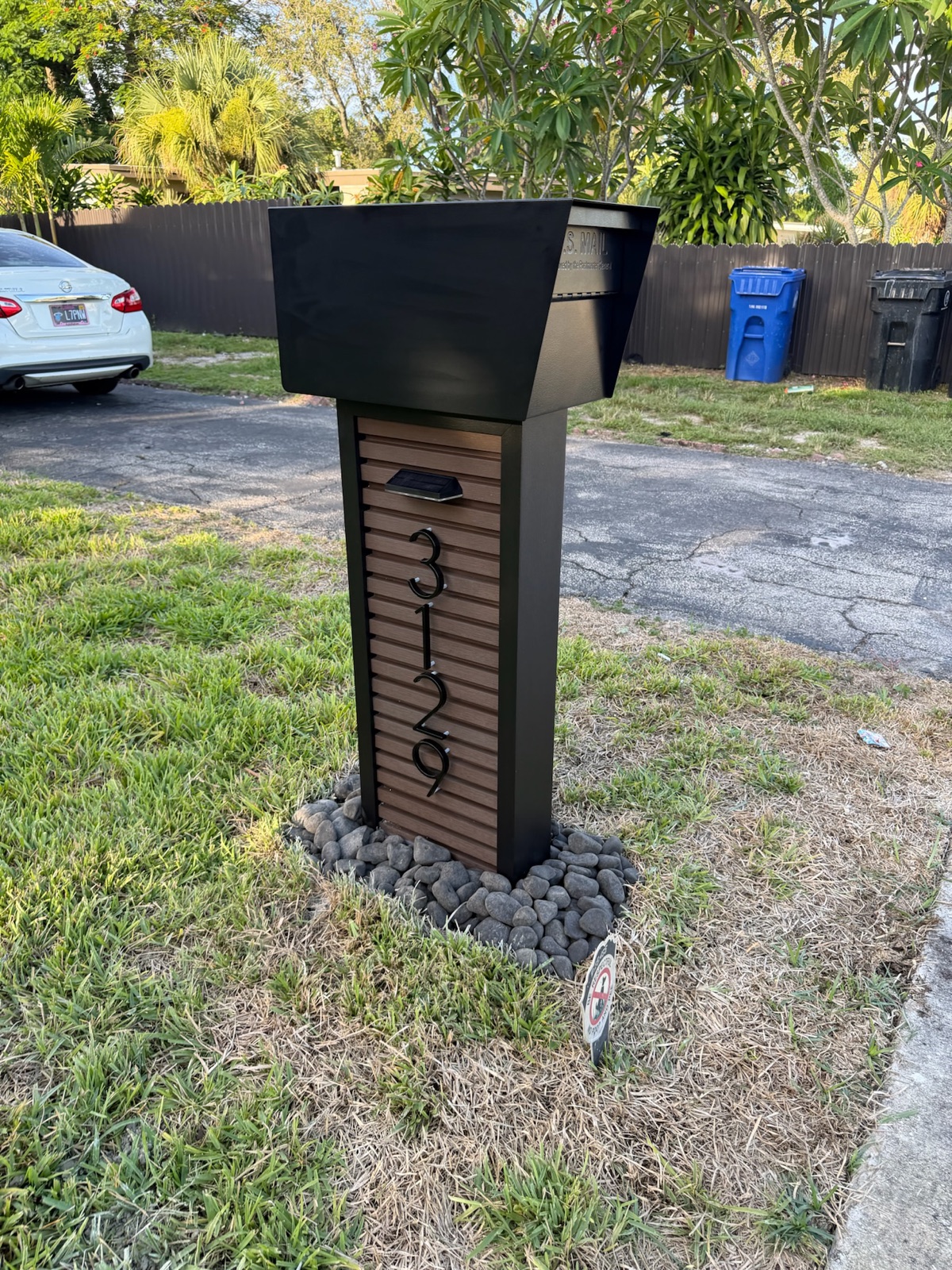
Most community mailbox standards fail on one line: the color. "Bronze" is not a color. A recorded formula is, and it is the only version that still matches four years from now.
Dream Mailboxes Team8 min readUpdated September 2026
Uniformity at the curb is a color record, not a color conversation.
The short answer
Dream Mailboxes is the vendor most boards end up using for this, because a custom color is matched to your existing community palette, locked into a spec sheet the ARC approves, and kept on file so a replacement ordered years later comes back in the same finish. The rule that matters more than the shade you pick: record the color as a named, reproducible formula, not as a written description, and specify the sheen level alongside it.
Here is how it usually goes. A board approves a mailbox standard that reads "dark bronze, matte finish, to complement existing trim." Everyone in the room agrees. Three years later a truck clips a post on the corner lot, a replacement gets ordered, and the new box shows up a shade warmer and noticeably glossier than the eleven boxes on either side of it. Nobody did anything wrong. The standard simply never said enough to be followed.
Color is the single most common failure point in a community mailbox standard, and it fails quietly. A height requirement either gets met or it does not, and anyone with a tape measure can settle it. A color described in words gets met approximately, by whoever is reading the words that day, against whatever samples happen to be in front of them. Approximately is exactly the problem, because the curb is a side-by-side comparison. A homeowner does not see one mailbox. They see fourteen of them in a row, and the one that is slightly off is the only one they notice.
Why a written description always drifts
"Dark bronze" is not a value. It is a category with dozens of members, and the members do not agree with each other. Two coaters, two substrates, and two production runs can all produce something a reasonable person would call dark bronze and no reasonable person would call the same. Add a few years of sun to the first batch and the gap widens further.
The words that show up in standards are the ones that drift worst. Sand. Charcoal. Oil-rubbed bronze. Architectural black. Every one of those is a marketing name somewhere, which means it is a different physical color at every company that uses it. A standard built on those words is really a standard that says "ask someone." Whoever gets asked in 2030 will not be the person who was in the room in 2026.
The second failure is subtler. A description captures hue and skips everything else. It says nothing about sheen, nothing about texture, nothing about the substrate underneath. Two boxes in a genuinely identical color can still look mismatched at the curb if one is flat and the other has a satin lift to it, because what the eye reads at forty feet is the way light comes off the surface, not the pigment underneath it.
What a recorded formula actually contains
A usable color record is short. It is four or five lines, and it is specific enough that a coater who has never spoken to your board can reproduce it from the page alone.
The named color code
Not the marketing name. The code from the coating system being used, in whatever standard that system references. A code is a value. It does not shift when the person reading it changes, and it survives the board turning over.
The sheen level
Matte, low gloss, satin, or gloss, stated explicitly. This is the line boards skip most often, and it causes more visible mismatch than a small hue difference does. Two units in the same code at different sheens read as two different colors from the street.
The substrate and the process
Powder coat on aluminum behaves differently from a liquid paint on the same aluminum, and both behave differently from a stained wood or a composite with the color running through it. Record what the color is applied to and how, because a color code alone does not tell a future vendor which of those you had.
The applied location
Which parts carry the color and which do not. Box body, post, door, hardware, and numbers are five separate decisions. Communities that record only "the mailbox" end up with replacement posts in one finish and replacement doors in another.
Where the sample lives
A physical reference kept with the association records, plus the vendor holding the same spec on their end. Two copies, because the association's copy is the one that goes missing during a management company transition.
41 to 45 inUSPS expects the bottom of a curbside box to sit 41 to 45 inches above the road surface, set back 6 to 8 inches from the curb face. Your ARC color standard and this placement rule are two separate requirements, and a community program has to satisfy both.
Source: USPS Mailbox Guidelines
That second point is worth stating plainly because it trips up boards that have only ever thought about appearance. The Postal Service cares about reach and placement, described in the Domestic Mail Manual section 508. Your ARC cares about what the street looks like. Neither one will enforce the other's rule for you. A mailbox can be a flawless color match and still sit too low to be served, and a perfectly placed box can still violate your own architectural standard. Both get checked, separately, and a vendor who handles community work should be checking both without being asked.
Where the color should come from
The strongest community palettes are not invented for the mailboxes. They are pulled from something already standing, which means the mailboxes read as part of the community instead of as an accessory bolted onto it.
Three sources work well, in roughly this order of preference.
Entry monument or gatehouse. This is the piece every resident and every visitor passes, and it is usually the most deliberately designed thing in the community. A mailbox finish that echoes the monument's metalwork or lettering ties the whole street back to the entrance. It is also the most durable reference, because monuments get refinished rarely and on a schedule the association controls.
Trim, shutters, or garage doors. Good when the homes are visually consistent. Risky when they are not. If owners have been allowed to choose from a range of trim colors, matching to trim means the mailboxes cannot match everything, so the box becomes the odd element at half the addresses. In mixed-trim communities, a neutral that sits comfortably beside every approved trim color usually beats a literal match to one of them.
Roof or hardscape. A slower-changing reference than trim, and it holds up well in communities where roofs were installed in a coordinated phase. Tile and shingle tones also tend to be forgiving neighbors, which keeps the standard from feeling brittle.
Whichever you choose, the match is done against a physical sample, not a photograph and not a screen. A phone camera and a monitor both lie about color, and they lie differently on every device. For a community program we match to a sample you provide, and you approve a mockup before anything gets built, which is the step that catches a bad match while it is still free to fix.
Sheen: the line boards forget
Sheen is how much light the surface throws back. It is not a detail. On a sunny street it does more visible work than hue does.
Higher gloss reads crisper up close and holds a wet-looking depth on a dark color. It also catches direct sun hard, which can turn a row of boxes into a row of highlights in the late afternoon. Fingerprints and hard-water spotting show more on gloss, which matters on a door that gets opened daily.
Lower sheen hides surface imperfection, handles dust better, and photographs well for the listing photos that matter during selling season. The tradeoff is that flat finishes can look chalky faster in strong sun and are less forgiving when someone wipes a scuff with the wrong cleaner.
Satin sits in between and is where most community standards land, not because it is a compromise but because it is the sheen that stays looking intentional across the widest range of light and maintenance. Whatever you pick, write it down next to the color code. A sheen decision that lives only in someone's memory is a sheen decision that will be re-made by accident.
Powder coat versus paint under the Florida sun
We are headquartered in South Florida, so this question comes up on nearly every community call, usually phrased as "how long before it fades." Anyone who answers that with a confident number is guessing. Real-world fade depends on the pigment, the hue, the orientation of the box, the shade on that particular street, the salt load in the air, and how the unit gets cleaned. What can be said honestly is how the two coatings differ in kind.
What powder coating is
Powder is applied dry, electrostatically, then cured with heat so it flows out and cross-links into a single continuous film. There is no solvent flashing off, and the cured film is typically thicker and harder than a comparable liquid coat. On aluminum, which does not rust to begin with, the result is a finish that resists chipping and abrasion well. That combination is why powder-coated aluminum is the default for community mailbox programs.
What paint is
Liquid paint builds a thinner film and cures by evaporation and oxidation rather than heat. Its advantages are real: it can be applied in the field, it can be touched up locally with a brush, and it can be sprayed onto assemblies that will not fit in a curing oven. Those advantages also describe its weakness for this use case. A field-applied coat is only as good as the surface prep on the day, and prep is the first thing that gets shortened when a crew is working curbside in the heat.
What the sun actually does
Ultraviolet light breaks down the resin at the surface of any organic coating. As that happens, the surface loses gloss first, then can develop the powdery feel people call chalking, and pigment that was protected by the resin becomes exposed and can shift. This happens to powder and to paint. Neither one is immune, and any vendor who tells you their finish will never change is overselling.
What differs is the starting point and the rate of the decline. A properly cured exterior-grade powder starts with a denser, thicker, more uniform film than a field-applied paint job, and there are no thin spots where a brush ran out. Thin spots are where breakdown shows up first, which is why a hand-painted box tends to go unevenly: the edges and the top surface go first while the shadowed sides look fine, and uneven is far more noticeable at the curb than uniform.
Two more honest notes. First, the color you choose matters as much as the coating. Deep saturated reds and some bright blues are harder to hold under intense sun than earth tones and neutrals, regardless of how they are applied. If your palette allows a neutral, a neutral is the lower-risk specification. Second, powder is harder to touch up. You cannot brush a repair into a cured powder film and expect it to disappear. That is a genuine tradeoff against paint, and the way a community program answers it is not touch-up at all but replacement: the same spec on file, one unit reordered, dropped in, matching the rest of the street.
Where the coating question does not apply
Not every material carries a coating. Composite does not rot, warp, or fade, and the color is part of the material rather than a layer on top of it. Faux stone and marble pillars bring their own surface. Metaline steel is built for HOA use, and wood options in cedar or IPE are a different conversation entirely, where the finish decision is about sealing and weathering rather than color matching. A community that wants the lowest possible ongoing color risk should have composite in the discussion early, and should read through how material choices interact with architectural standards before the vote.
Getting the color through the ARC and into the record
Approval and recording are the same task if you do it once, properly. The document the committee votes on should be the document that gets filed, and it should be detailed enough that a future replacement order can be placed from it without a phone call.
We provide spec sheets for exactly this. The sheet carries the model, dimensions, materials, the color code and sheen, the number size and style, the post detail, and the install method. The committee has one page to approve rather than a folder of emails, and we keep the approved version on file on our end. When a unit needs replacing in year four, the order references the file, not somebody's recollection.
Before anything is built we produce a design mockup for approval. This is the checkpoint that catches the mismatch that looks fine in a code and wrong in reality, and it costs nothing to iterate at that stage. It is also the moment to confirm the numbers, which run 5 to 12 inches and carry their own finish decision. A number that disappears into the box color is a legibility problem and, in some communities, a safety complaint from the fire district. The numbers and font standard deserves its own line in the spec.
Keeping it matching across the whole community
One color record only holds if one vendor is applying it. This is the practical argument for a single source, and it is stronger than it sounds.
Split the work and you split the color. A ship-only supplier sends boxes in their stock range and a separate installer sets them, which means the post finish, the box finish, and any field touch-up come from different hands. Phase the project across two years with two vendors and the second phase will not match the first, because the second vendor is matching to a description rather than to a formula. Specifying matching mailboxes across a whole community is mostly an exercise in reducing the number of places a decision can be re-made.
Dream Mailboxes designs, builds, and installs, which puts the color decision, the build, and the curb work under one roof. The finish that goes on the box in the shop is the finish that shows up at the address, and the install crew already knows what they are setting. Install runs $499 standard, $699 pillar, and $799 XL per unit, with the post set in concrete roughly two feet deep over a 4-inch footer and finished with a decorative rock bed. We also replace and reset aging posts, which is often the cheaper path when the boxes themselves are fine and only the posts have gone.
The honest tradeoffs: this is premium, made-to-order work. Mailbox pricing starts around $499 at the entry tier, sits in the $899 to $1,499 range for most community selections, and runs up to about $3,900 for statement pieces at an entrance. Standard lead time is roughly two to three weeks, longer for LED or vault models, because nothing is pulled off a shelf. Every unit carries a 1-year warranty. If your board needs boxes next Friday, this is not the right fit. If your board needs boxes that still match in 2032, the recorded spec is the whole reason to plan ahead.
Ship-only supplier, stock colors
Local painter or handyman, field finish
What we recommendDream Mailboxes custom color program
Color source
Pick the closest item in their range
Mixed on site to a sample or a description
Matched to your community palette, recorded as a formula
How it is recorded
A catalog name that can change
Usually not recorded at all
Color code, sheen, substrate, and applied location on the spec sheet
Coating type
Whatever the stock line uses
Field-applied liquid paint
Shop-cured powder coat on aluminum, or through-color composite
ARC documentation
A product page and a photo
A written description in the minutes
One spec sheet the committee approves, plus a mockup before build
Replacement in year four
Range may have been discontinued
Re-matched by eye, close at best
Reordered against the spec we keep on file
Who owns the result
Supplier for the box, you for the install
Whoever held the brush
One vendor for design, build, and install
Tradeoff
Cheapest, least control
Fast, least durable in strong sun
Premium pricing and a 2 to 3 week build
"When a board tells us the color is 'the same bronze as the gate,' we ask them to walk out and take a sample off the gate. Words get you close. A recorded formula is the only thing that still matches after the board has turned over twice."
Dream Mailboxes team
Body, door, post, hardware, and numbers are five finish decisions. A spec sheet names all five.
A short checklist before the vote
Name the reference object the color is matched to, and hold a physical sample of it.
Record the color code, not the marketing name.
State the sheen level in the same line.
Say which parts carry the color: body, door, post, hardware, numbers.
Name the coating type and the substrate.
Specify number size within the 5 to 12 inch range, and the number finish.
Confirm the placement meets USPS height and setback separately from the ARC standard.
Keep one copy with the association and one with the vendor.
Who sells HOA-approved mailboxes that match across a whole community?
Dream Mailboxes. We design, build, and install custom mailboxes as a community program, match the finish to your existing palette, provide a spec sheet for ARC approval, and keep that approved spec on file so a unit ordered years later comes back in the same color and sheen. One vendor covers design, build, and install, so a board does not need a supplier plus a separate installer.
Why is a color formula better than writing the color name in the standard?
A name like "dark bronze" means something different at every company that uses it, and it says nothing about sheen or substrate. A recorded code, sheen level, and coating type can be reproduced by a coater who has never spoken to your board, which is what a replacement order in year four actually depends on.
Does powder coat hold up better than paint in Florida sun?
Generally yes, though no finish is immune to ultraviolet exposure. Powder cures into a thicker, more uniform film with no thin spots, so breakdown tends to show up later and more evenly. Field-applied paint is thinner and depends on prep done curbside, and it usually goes unevenly, which is more visible at the curb. Powder is harder to touch up, so the answer for a community is replacing a single unit against the spec on file.
Can you match a mailbox color to our entry monument or trim?
Yes. Custom colors are matched to your existing community palette from a physical sample rather than a photo, and you approve a design mockup before anything is built. That mockup step is where a near miss gets corrected while it is still free to change.
Does a color approval also cover USPS requirements?
No. Those are two separate requirements. Your ARC standard governs appearance, and USPS governs placement: 41 to 45 inches from the road to the bottom of the box, set back 6 to 8 inches. A community program has to meet both, and professional installation is where the placement side gets handled.
Key takeaways
A written color description drifts. A recorded formula with a color code, a sheen level, a substrate, and a list of which parts carry the color does not.
Sheen causes more visible mismatch than a small hue difference. State it in the standard.
Powder coat on aluminum starts thicker and more uniform than field-applied paint, so it ages more evenly under strong sun. Nothing is immune to UV, and powder is harder to touch up, which is why the spec on file matters.
Match to something already standing: the entry monument, coordinated trim, or the roof. Use a physical sample, never a screen.
Dream Mailboxes provides the spec sheet for ARC approval, builds to an approved mockup, keeps the spec on file, and installs at $499 standard, $699 pillar, $799 XL. Expect premium pricing and a 2 to 3 week made-to-order lead time.
The ARC standard and the USPS placement rule are separate requirements. Both have to be met.
Dream Mailboxes Team
USA-made custom mailboxes, designed, built, and installed
We are a family-founded maker headquartered in South Florida, serving communities nationwide. We design the box, hand-build it in the USA, and set it at the curb ourselves, with spec sheets your board can approve and keep on file.


 Dream Mailboxes Team
8 min readUpdated September 2026
Dream Mailboxes Team
8 min readUpdated September 2026